PR
Development Institute
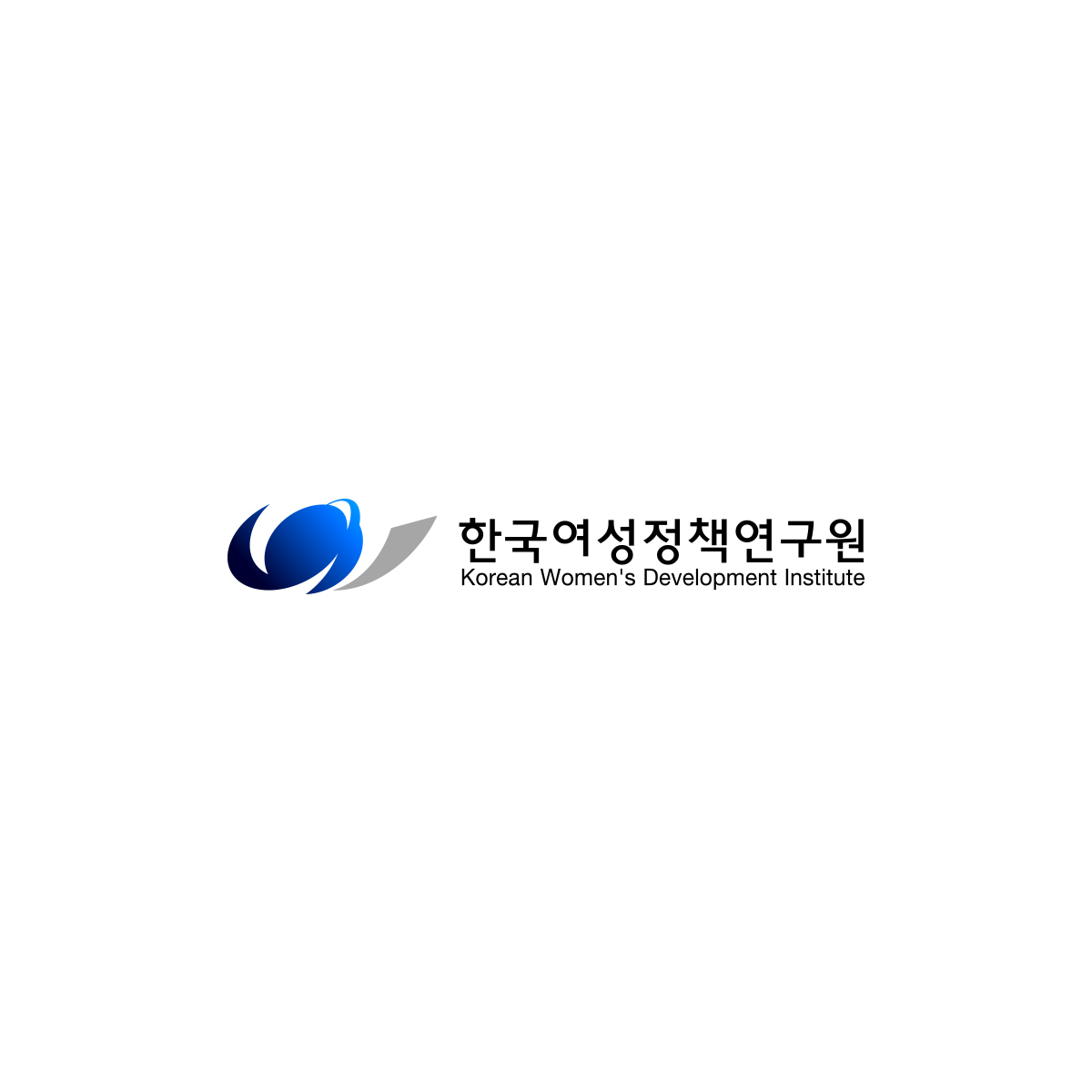
Identity
The new CI is an imagery of the initial “W” for Woman and the world (the globe), symbolizing KWDI’s efforts towards the fulfillment of
gender equal society. Each wing on the left and right represent the active women and the collaboration of men. And the ellipse
in the center indicates a harmonizing society of gender equality.
In color, the main scheme is blue, representing globalization, rebirth, idealization and hope. And grey is to express harmony.
Signature
-
[ Ideal And Hope ]Active Women#0074FF
-
[ Coexistence And Rebirth ]Harmonizing Society Gender-Equal Society#373658
-
[ Harmony And Cooperation ]Collaboration Men#A6A6A6
Brochure
KWDI is a women’s policy think-tank working towards the realization of gender equal society. And we wish to grow ourselves into a global institute and contribute our efforts to women’s development.